PEOPLE’s fibre
In 2019 I joined People’s Fibre - a startup specialising in full fibre broadband - as their lead designer and animator.
The first illustration I created was a huge isometric broadband ‘city’, featuring nine interconnected islands representing different areas of the business: residential, business, property development and HQ.
I used this isometric style to build People’s Fibre’s visual identity, using it across everything including the shop interior, van decals, website and social marketing.
Intro video
At first the city is disconnected, plagued by slow internet. Fibre optic cable then pulls the islands together, fully connecting the city.
The ‘city’ illustration itself was created as a vector entirely in Illustrator, allowing me to zoom in and out of the islands without losing any quality.


French-fold Flyer Design
Braintree ‘city’
Our office was based in our key rollout area of Braintree in Essex, and for our marketing I created an even larger isometric city representing Braintree town (it isn’t actually a city!).
As well as for use in our marketing, this illustration was printed and installed as a mural in the Braintree shop - see picture below.
2021: a braintree odyssey
To promote our Braintree launch, I superimposed the distinctive People’s Fibre logo into drone footage of the town.


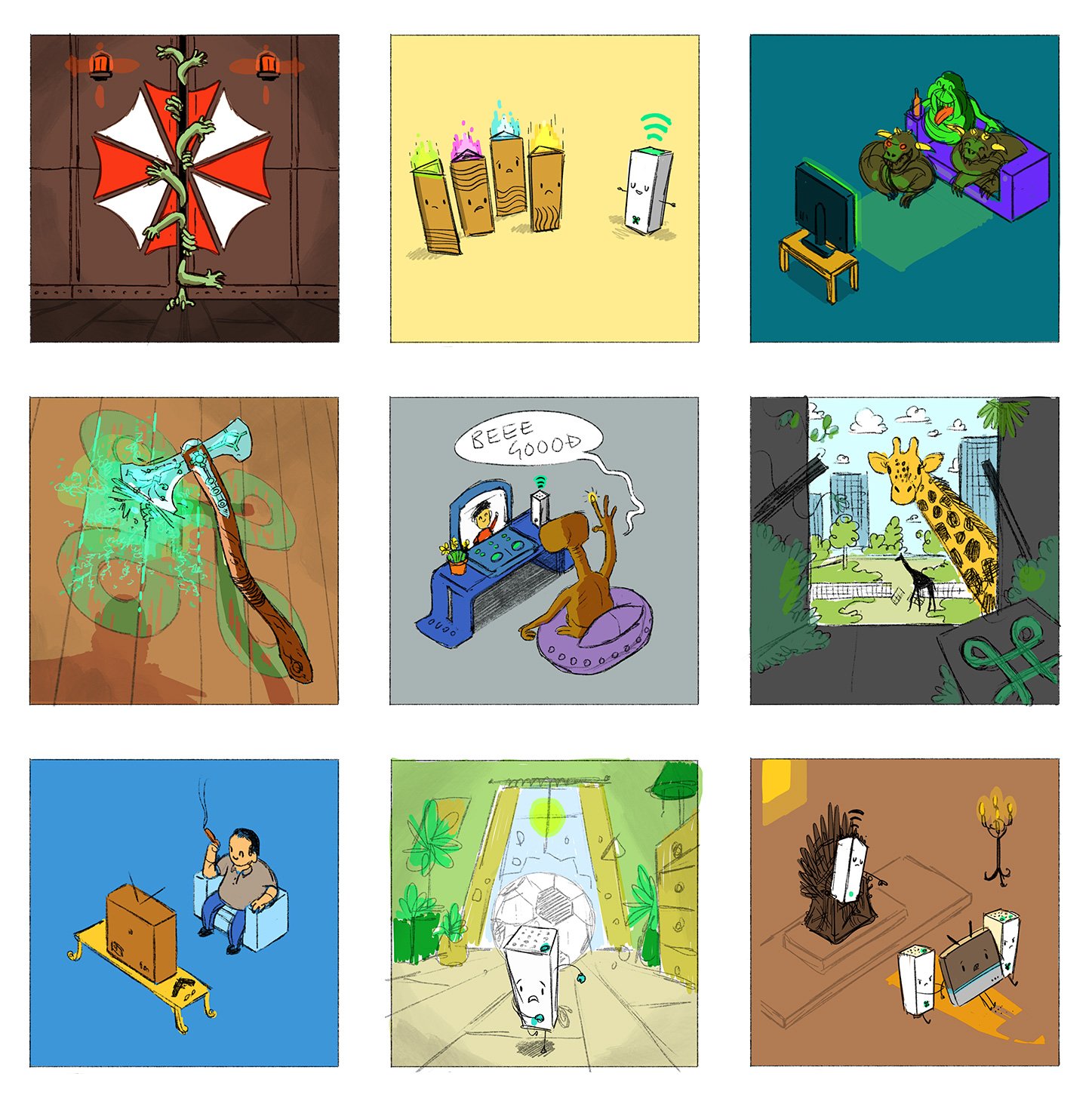
Dave the Dragon
Valentine’s Day


Shop Design
I had the incredibly fun job of designing the interior of our completely refurbished shop in Braintree. I stitched together various photos of the interior, and used these as reference for my designs.
Sketch Timelapses