scoop gelato
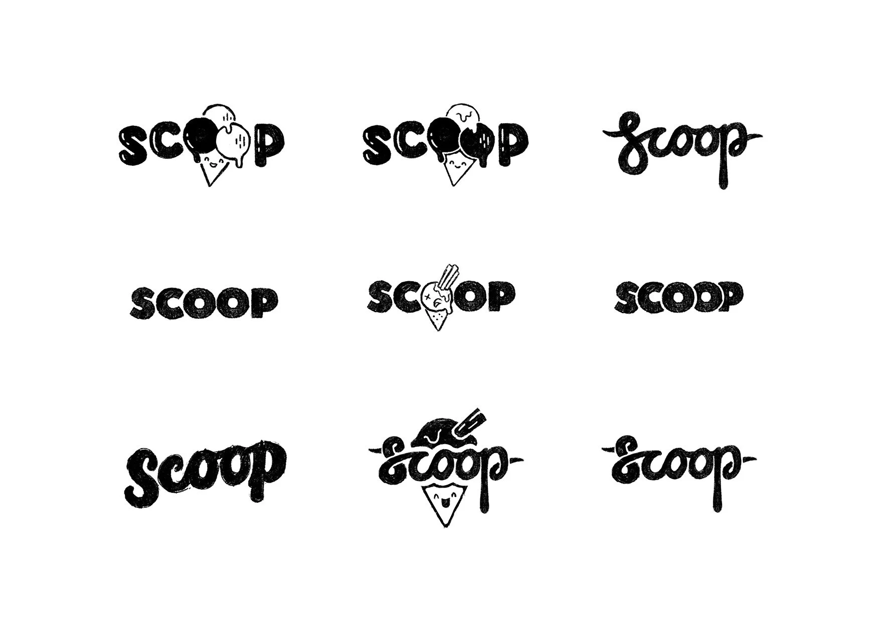
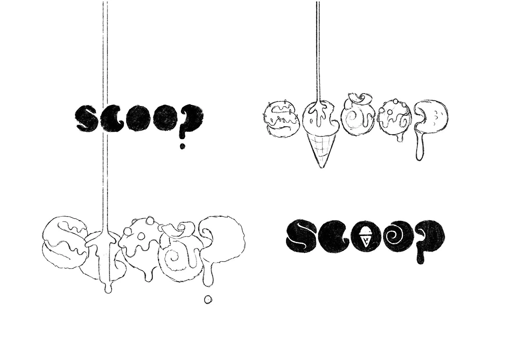
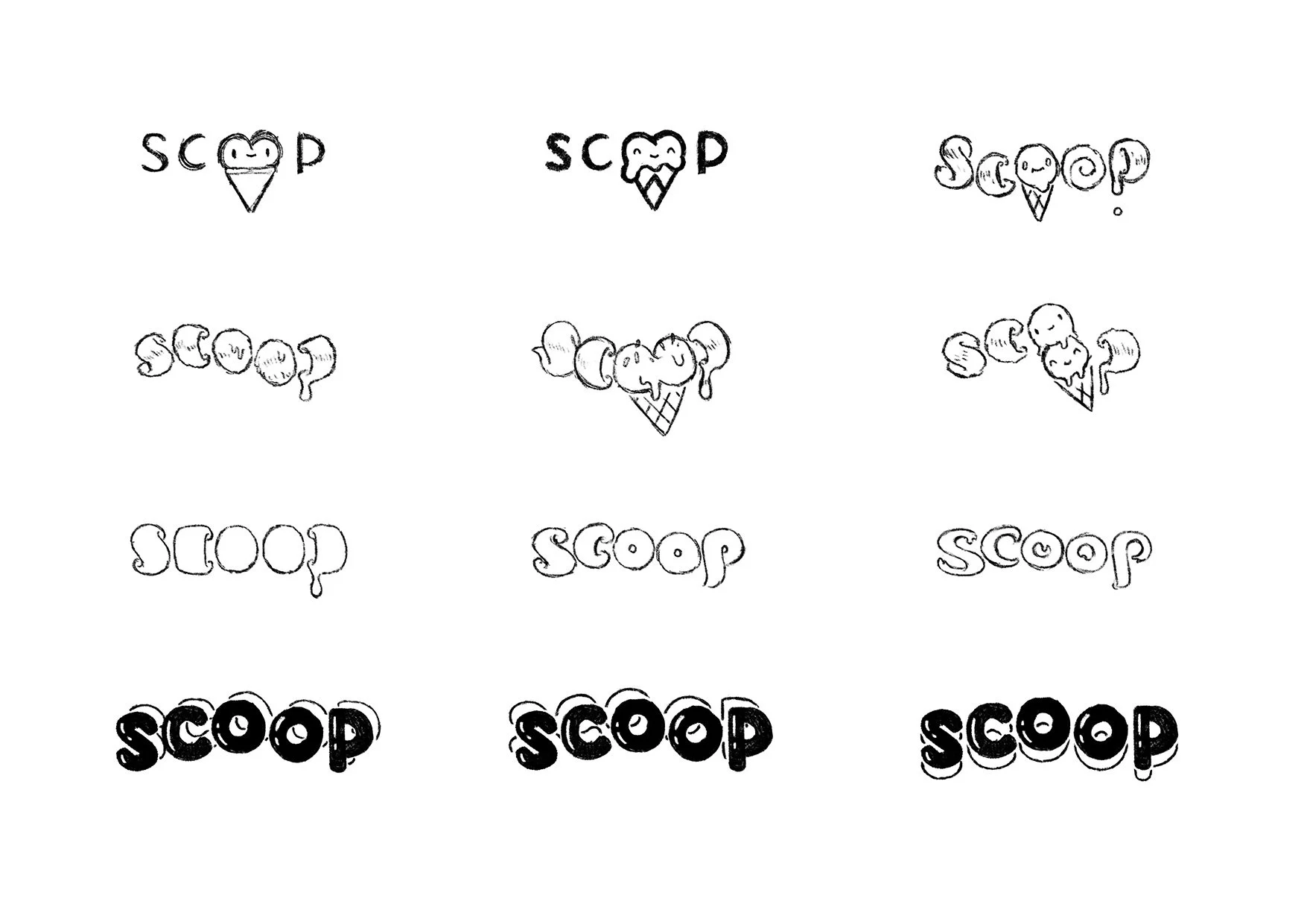
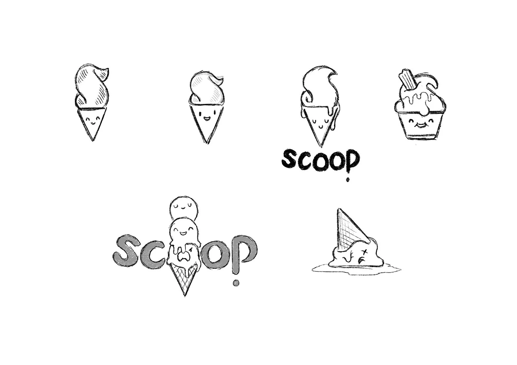
I had the amazing job of designing the logo and illustrations for the gelato shop ‘Scoop’ in Selkirk.
Funny, tasty and colourful was key: this is what I wanted the main logos and illustrations to imply, i.e. drippy ice cream, whipped shapes, happy faces. I started with trying to emulate the 50’s American Diner style of typography, and then veered towards a ‘candy town’ vibe.

Scoop becomes Soop
Sweet becomes savoury!
During the colder seasons ‘Scoop’ transformed into ‘Soop’, selling hot soups, jacket potatoes and sandwiches.
As well as creating an alternative logo, I designed a range of cute vegetable characters. I imagined them taking over, taking the letter ‘C’ away and kidnapping Scoop’s ice cream cone mascot.


